

Choosing the right colors for your restaurant
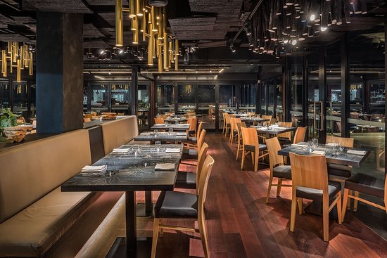
The interior design of a restaurant is not just about its decor and ambiance. The color palette also plays a very essential role when it comes to the interiors. It influences the perception of the customer as well as their buying decision. Therefore, the color palette of the restaurant interiors should be chosen wisely and, it should also be in correspondence with the theme and style of your restaurant.
For instance, warm tones in the entrance make the customer feel a higher temperature than normal while cooler shades make people feel like the temperature is more soothing and relaxed. Let’s have a look at the most commonly used color themes for restaurants.
Greens & Browns
The one color that has always been associated with nature is green and, no doubt it creates a very relaxing atmosphere in a restaurant. It makes the customers feel relaxed and stay for longer periods. Along with that, it encourages them to eat well-balanced and healthy food.
A calm tone of green is a great choice for health-based restaurants with hints of wooden brown. Whereas, green might not be suitable for bars and pubs as it tends to look depressing and gloomy. Brown can be used in minimal amounts and styles without overpowering the entire theme.
Reds & Yellow
The most widely used colors for logos are red and yellow. They are cheerful and, also tend to elevate the heart rate and blood pressure of the customers which results in them eating faster and leaving. This is the reason why most of the fast-food restaurants opt for these color palettes for their interiors including accessories and tables.
Therefore, the red and yellow color theme is preferred for restaurants where the footfall is higher and, the customers leave fast.
Whites, Beiges & Greys
Bright colors such a white and beige on the walls will make a small spaced restaurant look big. These colors tend to evoke a welcoming and relaxing feeling which akes the customers stay for more. If one wall s painted in a bright color, the other wall can be neutral with white or beige, creating a balance in design. In order to make the place look more spacious, while is an excellent choice for the ceiling.
Make sure to not go overboard with these colors and, try using them in contrast with other colors. For instance, beige can be incorporated with mint green o rhinitis of red that breaks the effect of light colors without overpowering them.

0 comment